“Simplicity and harmony are key visual elements that reflect the seamless connectivity and intuitiveness of Office apps. While each icon has a unique and identifiable symbol, there are connections within each app’s symbol and the collective suite.”
— Jon Friedman, Head of Microsoft Office design
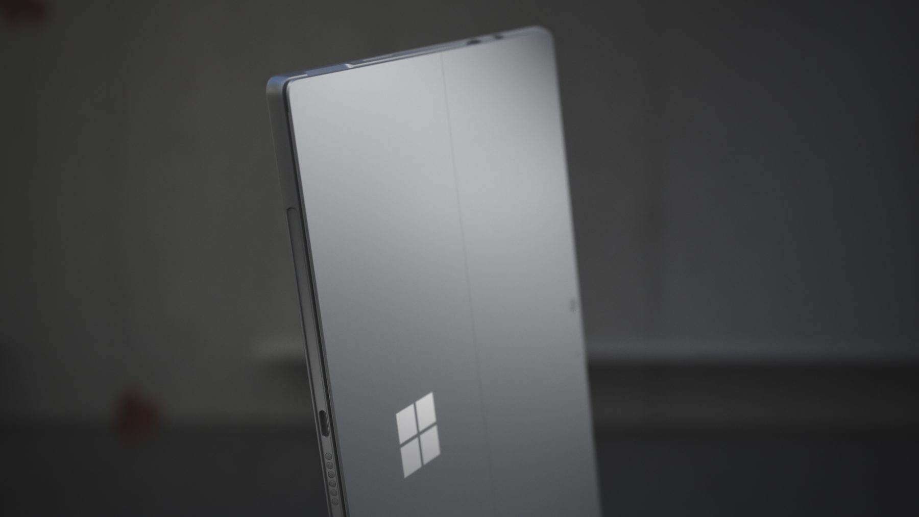
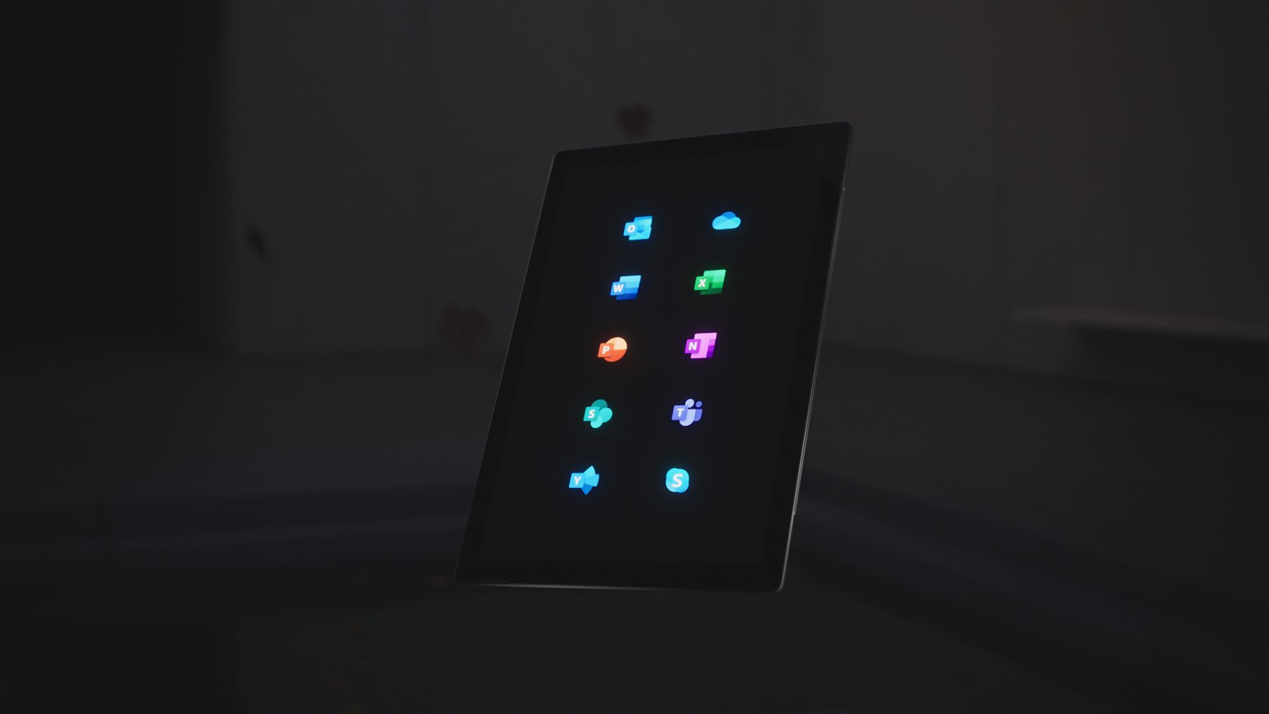
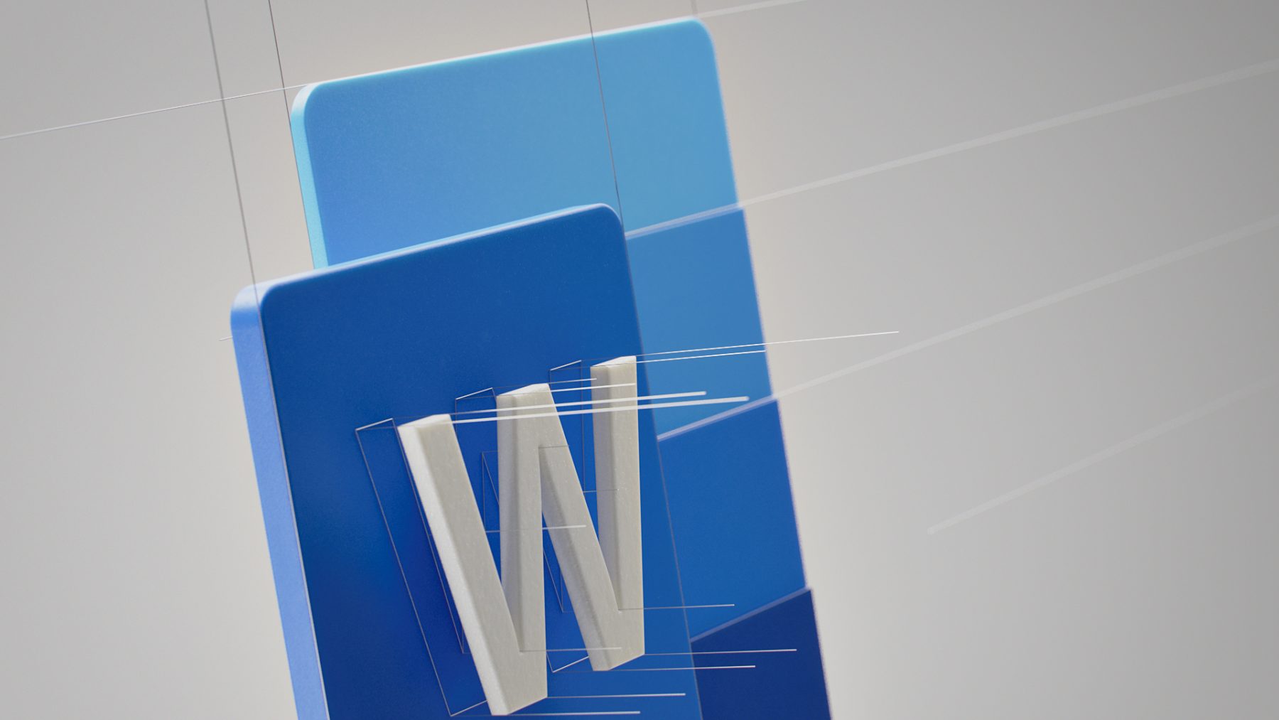
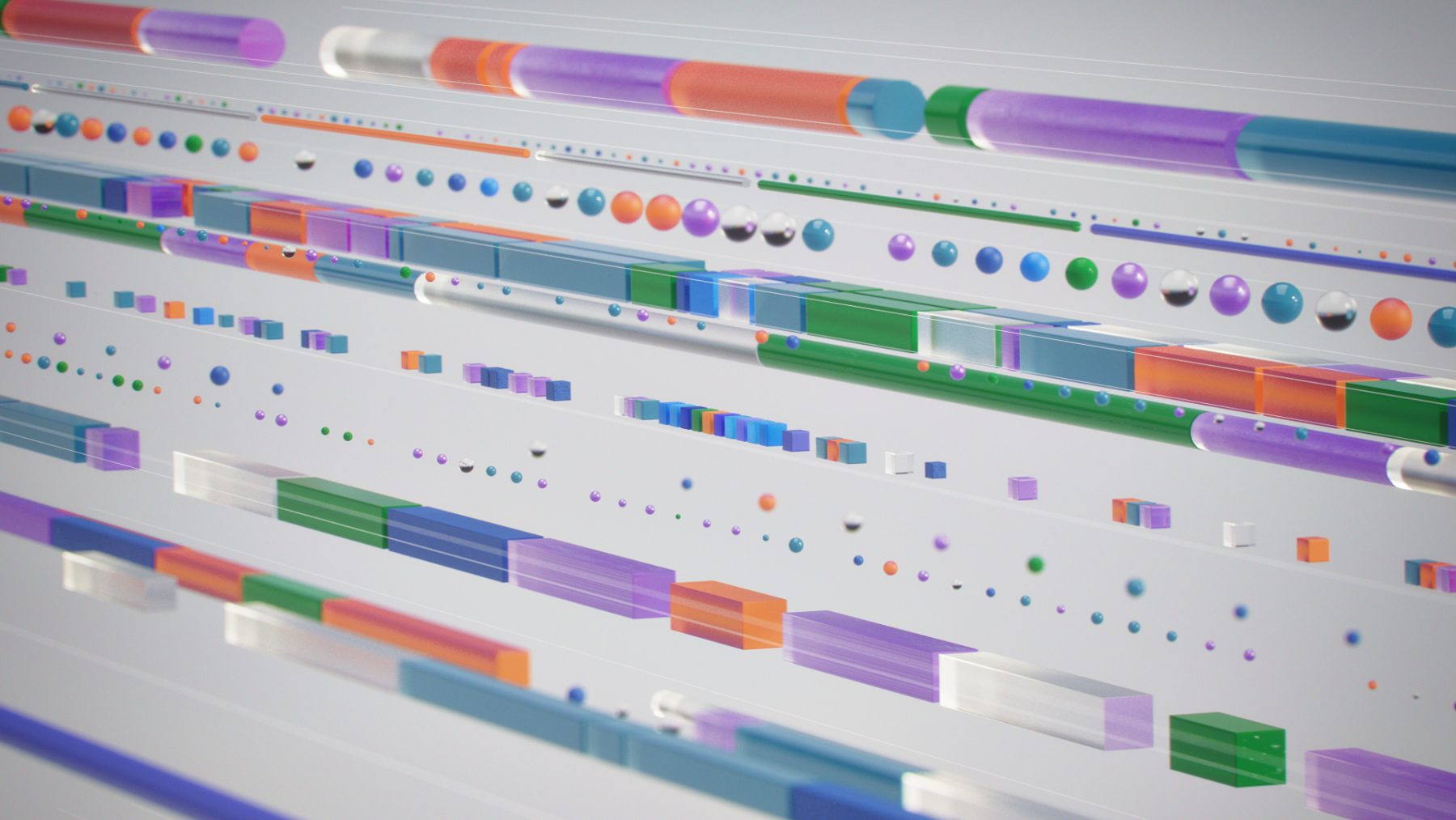
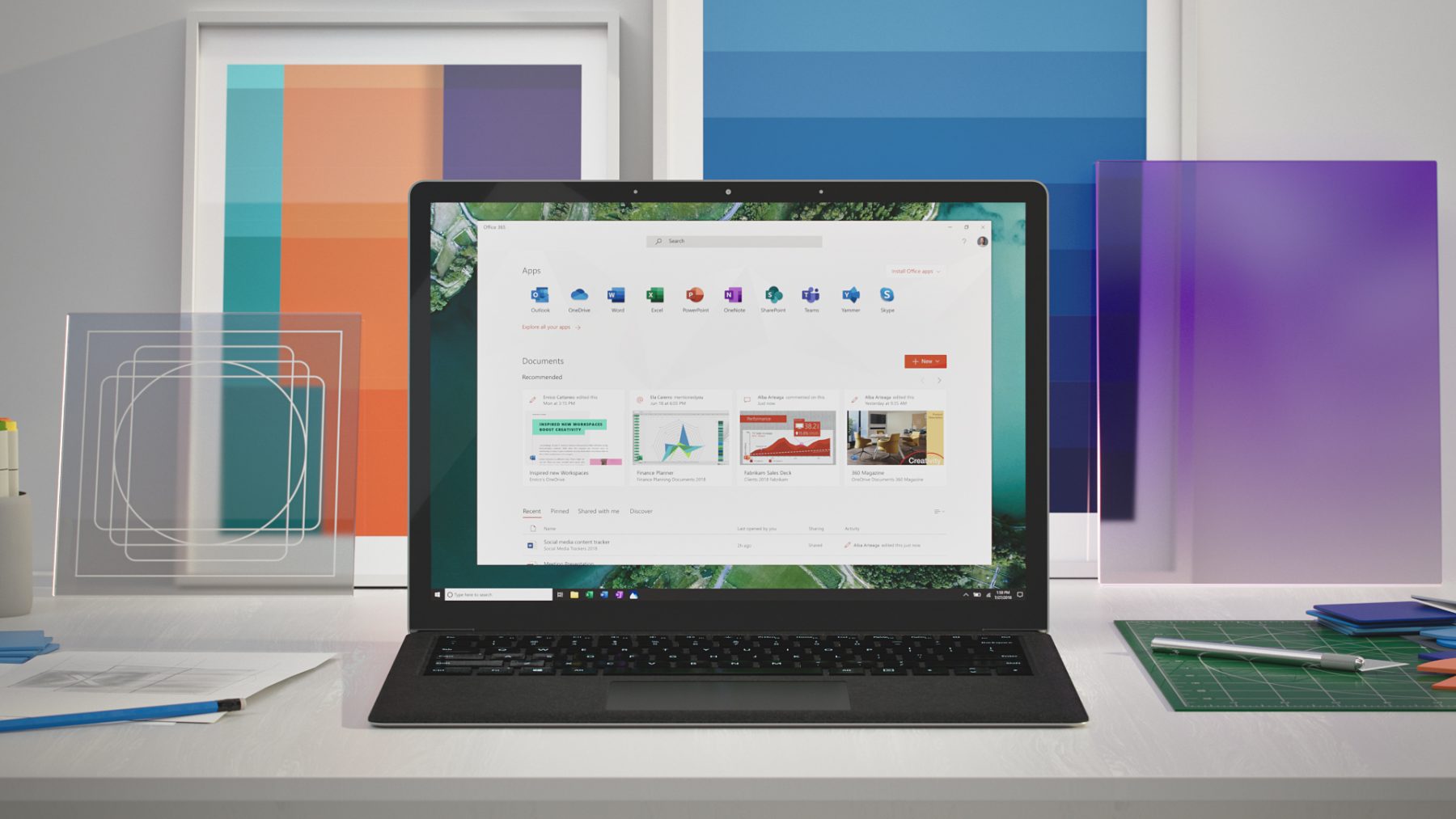
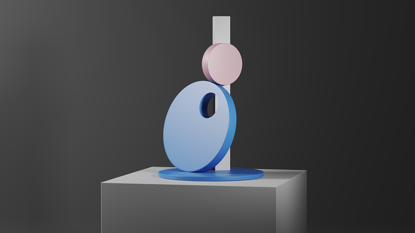
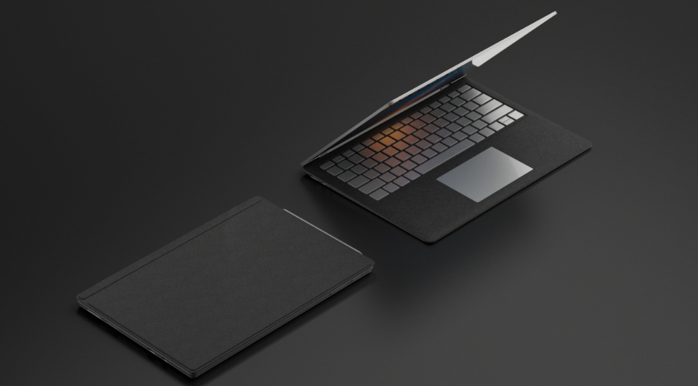
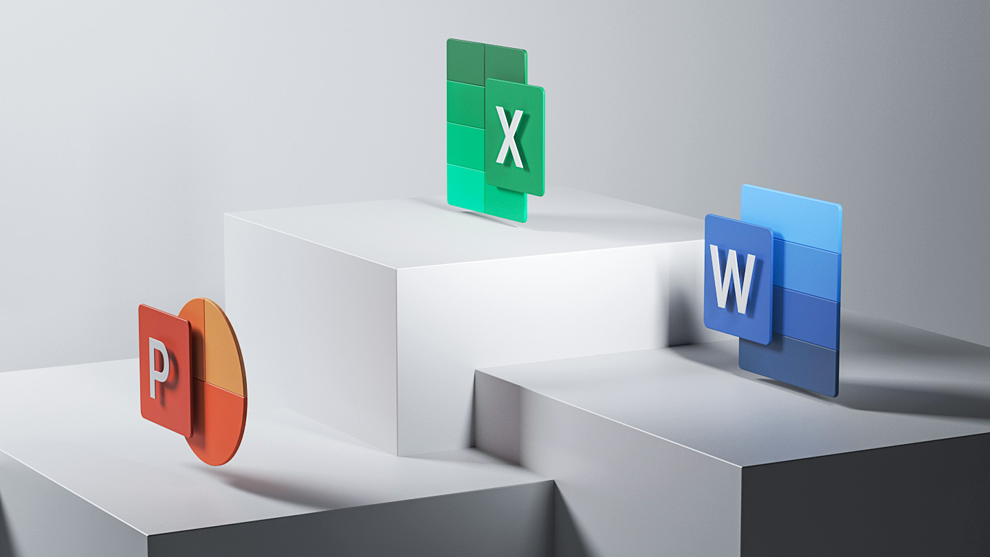
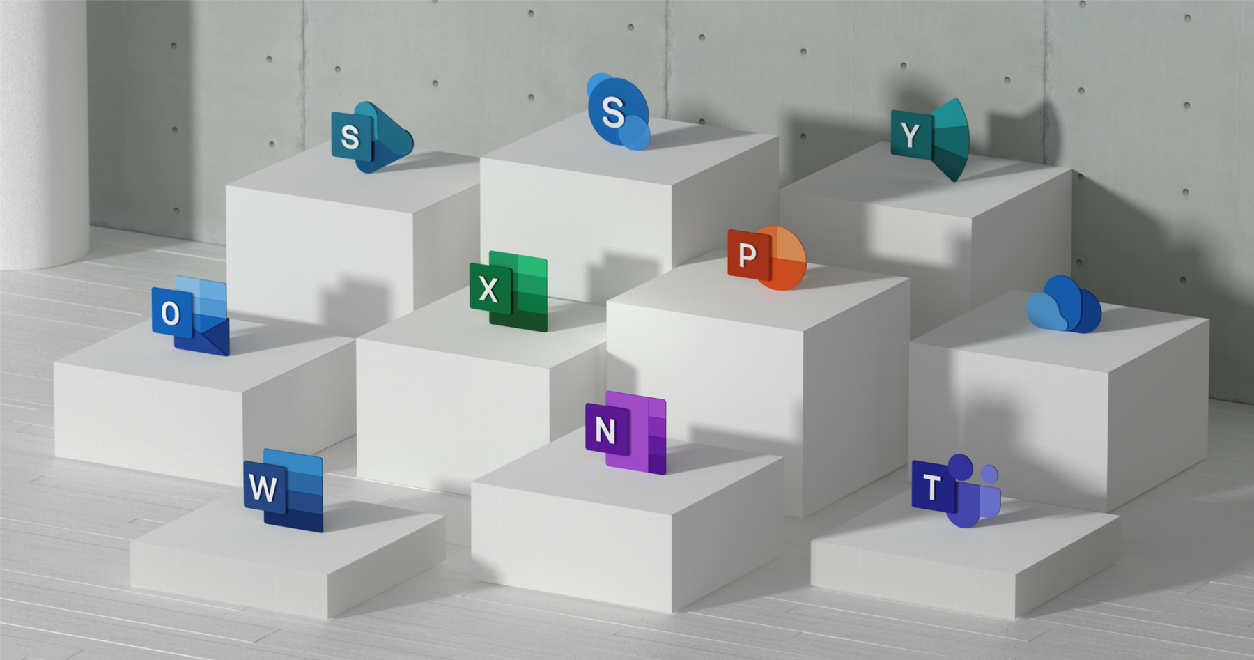
Microsoft has paid incredible attention to detail in the design of the Office Suite and Surface hardware products. That same unique, thoughtful design thinking has extended into the design of the Office icons. Every corner radius and angle has meaning and purpose, aimed at enhancing the user experience.
Tendril collaborated closely with the team at Microsoft to create a reveal film that captures the essence of these values—The craftsmanship of the the icons and the design thinking that went into them—Drawing parallels between the design engineering of the Surface devices and the the icon designs. Read more here.


Process
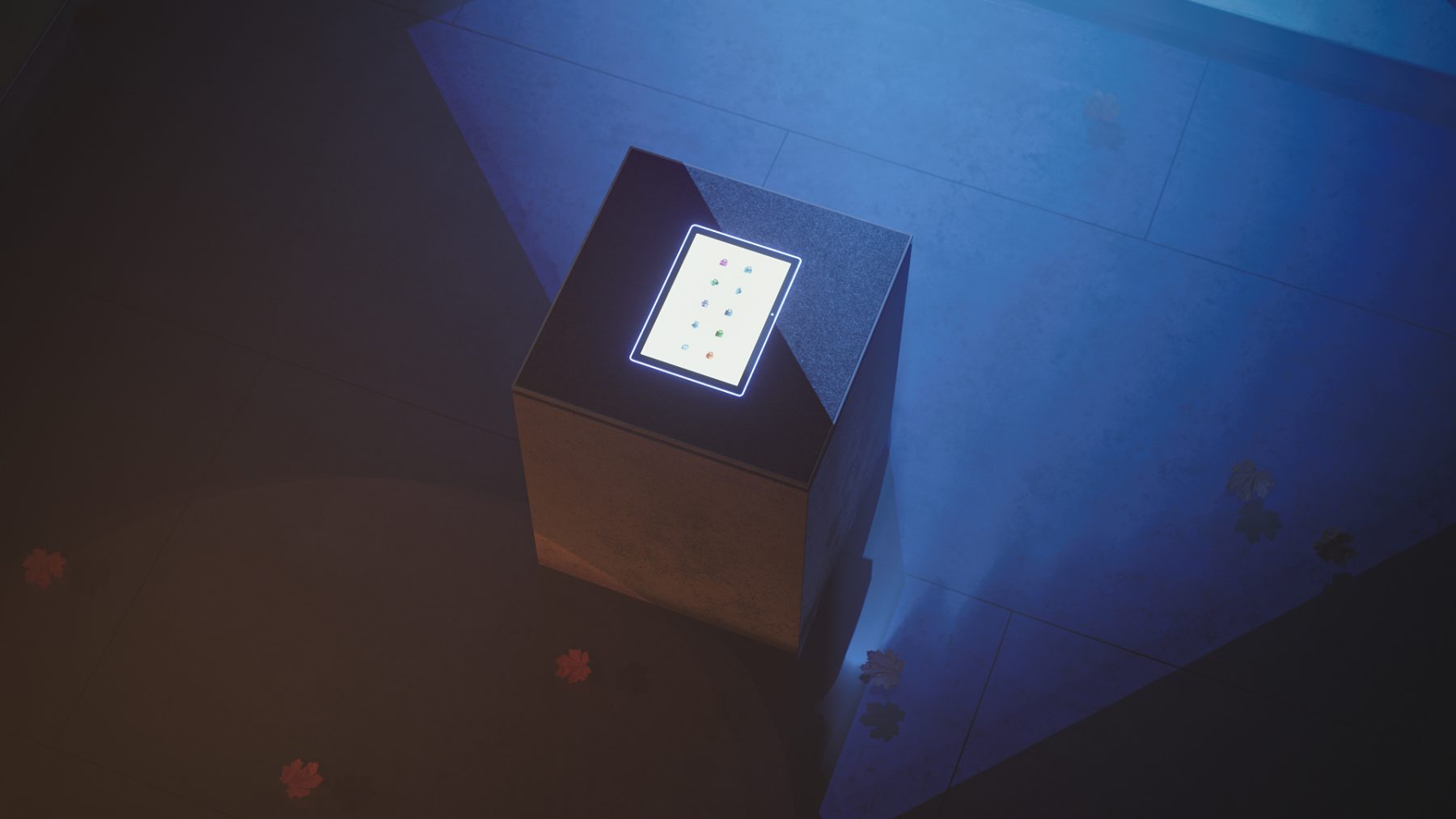
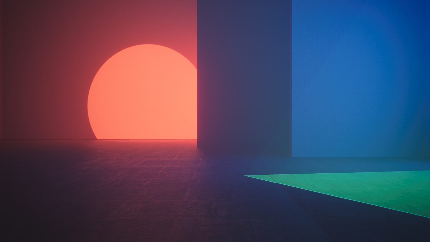
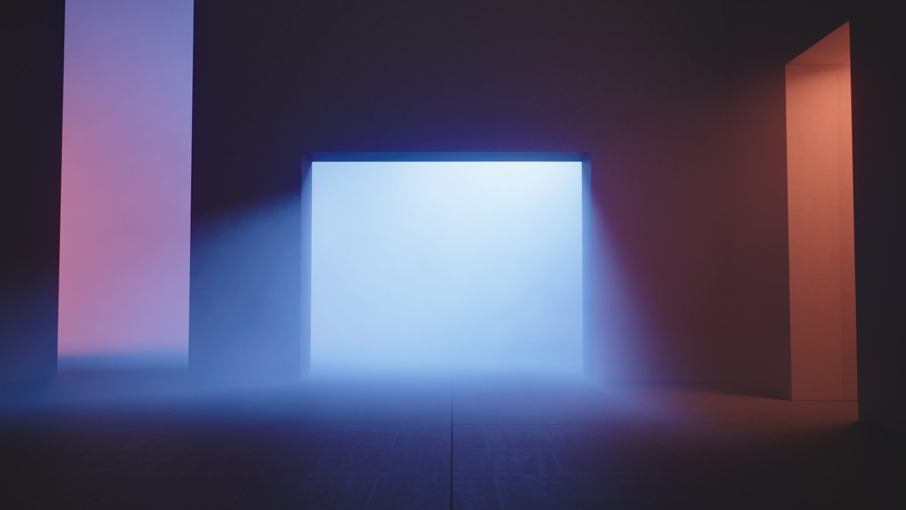
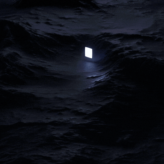
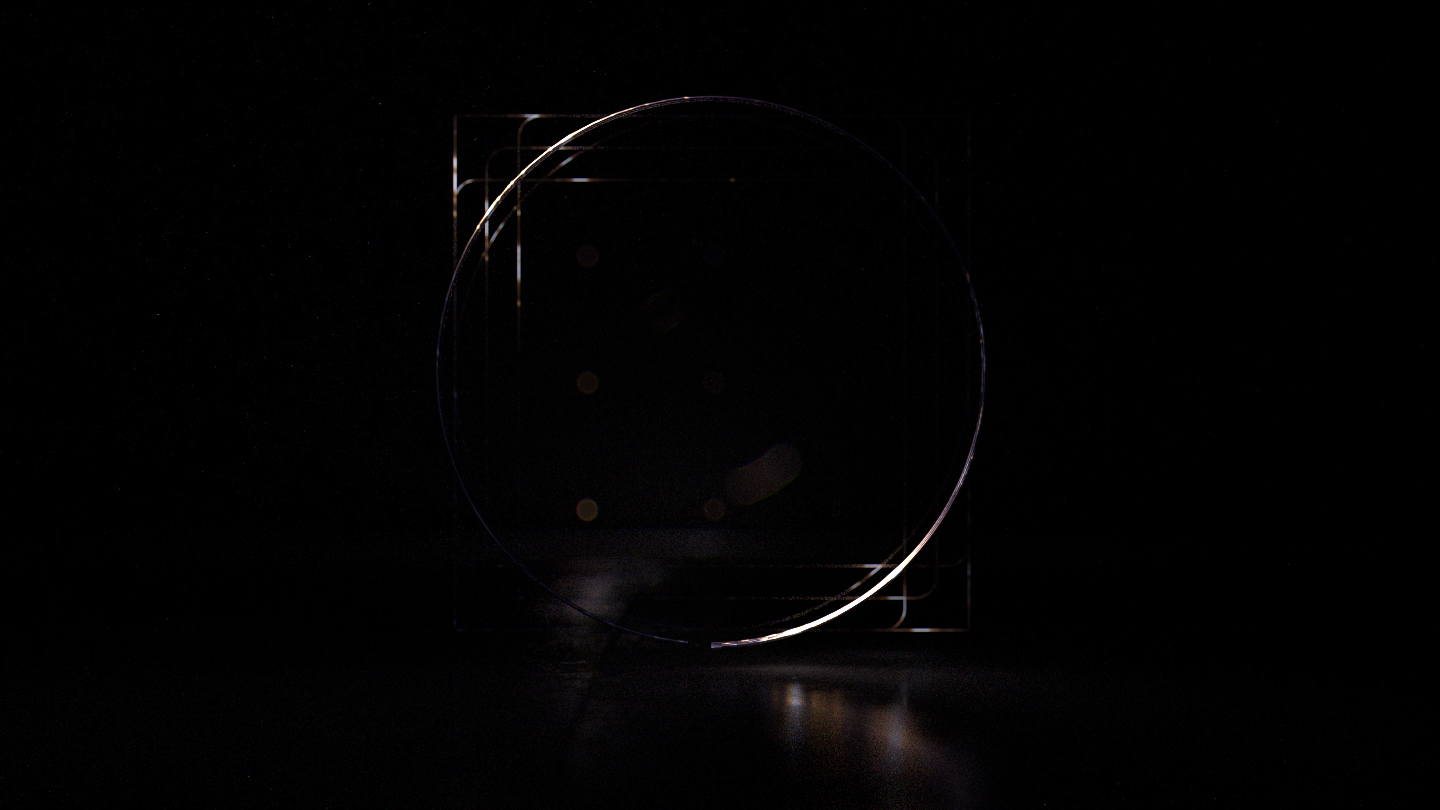
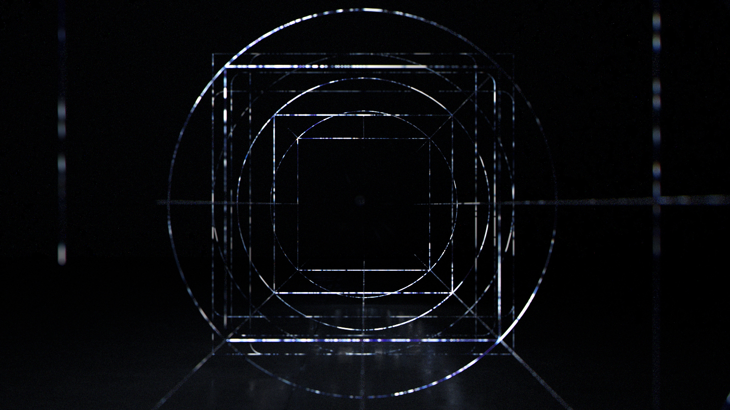
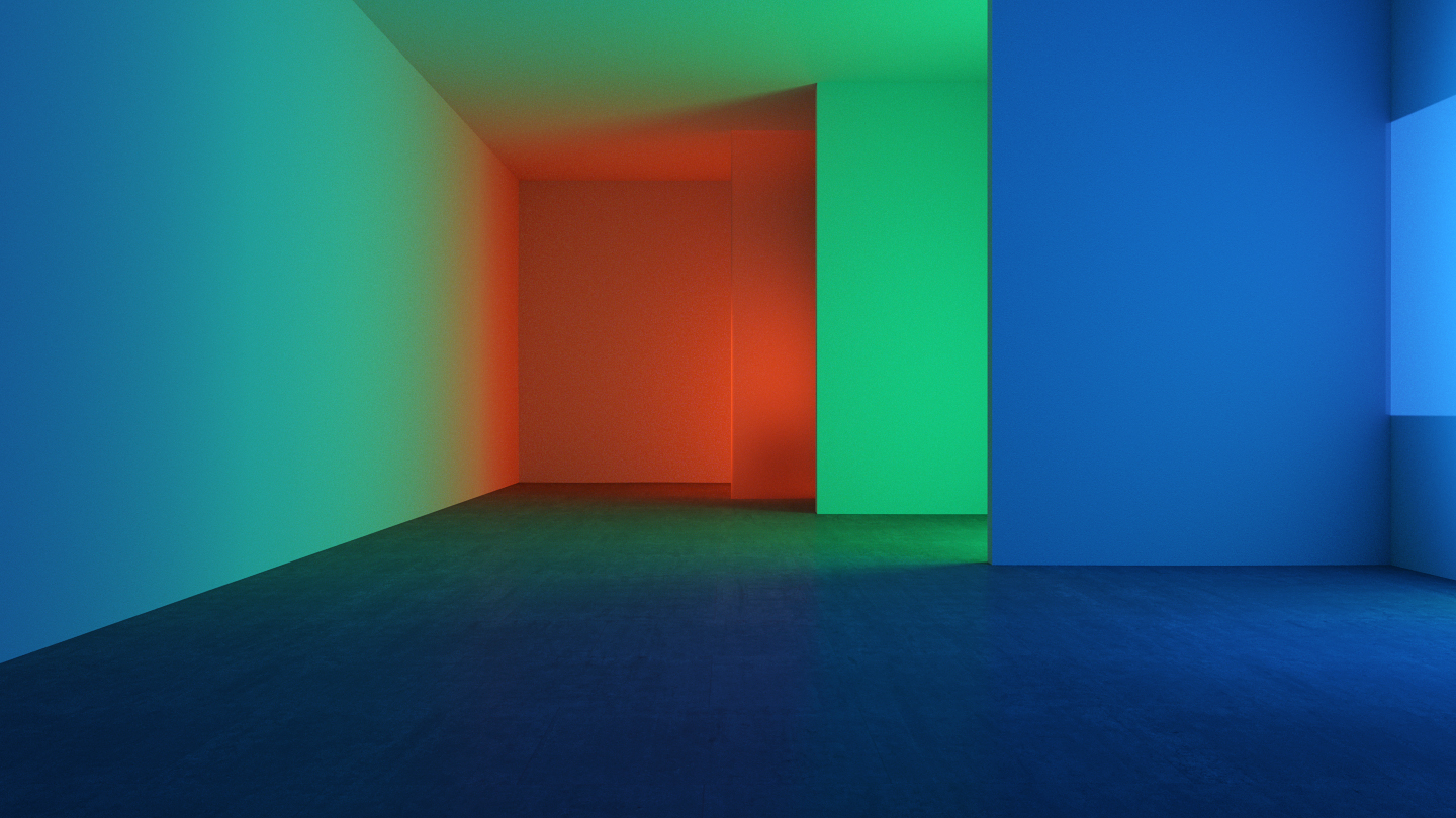
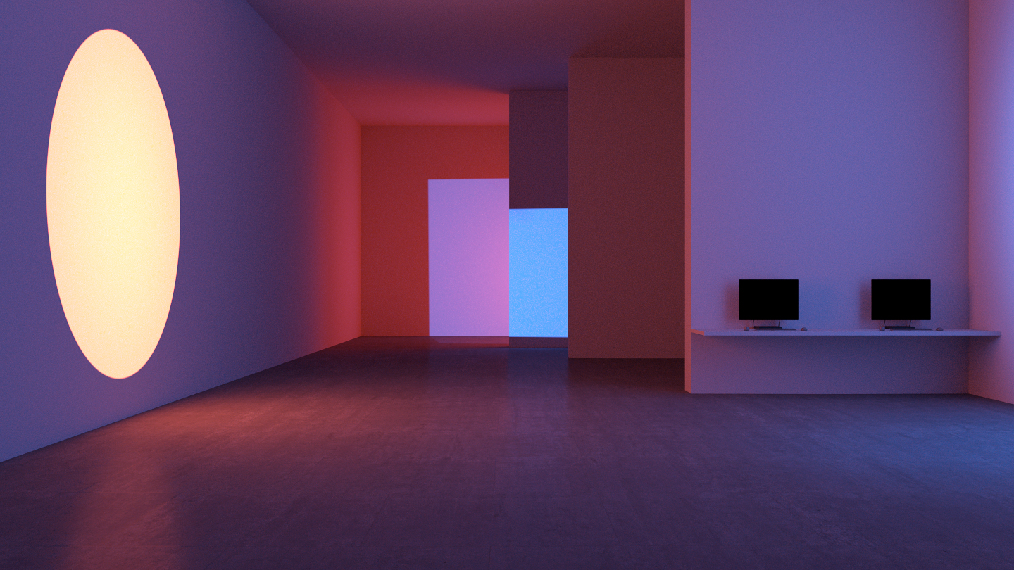
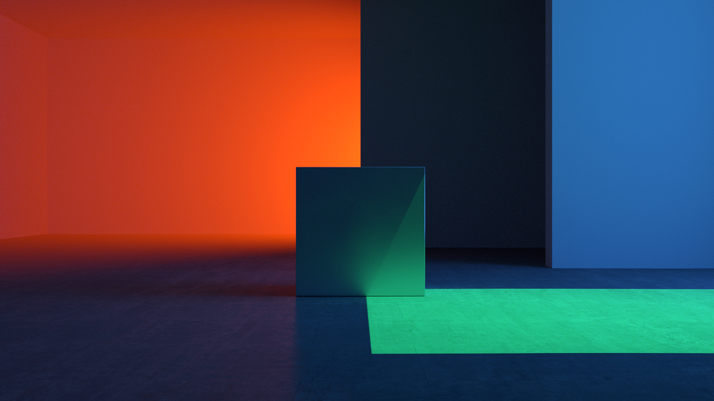
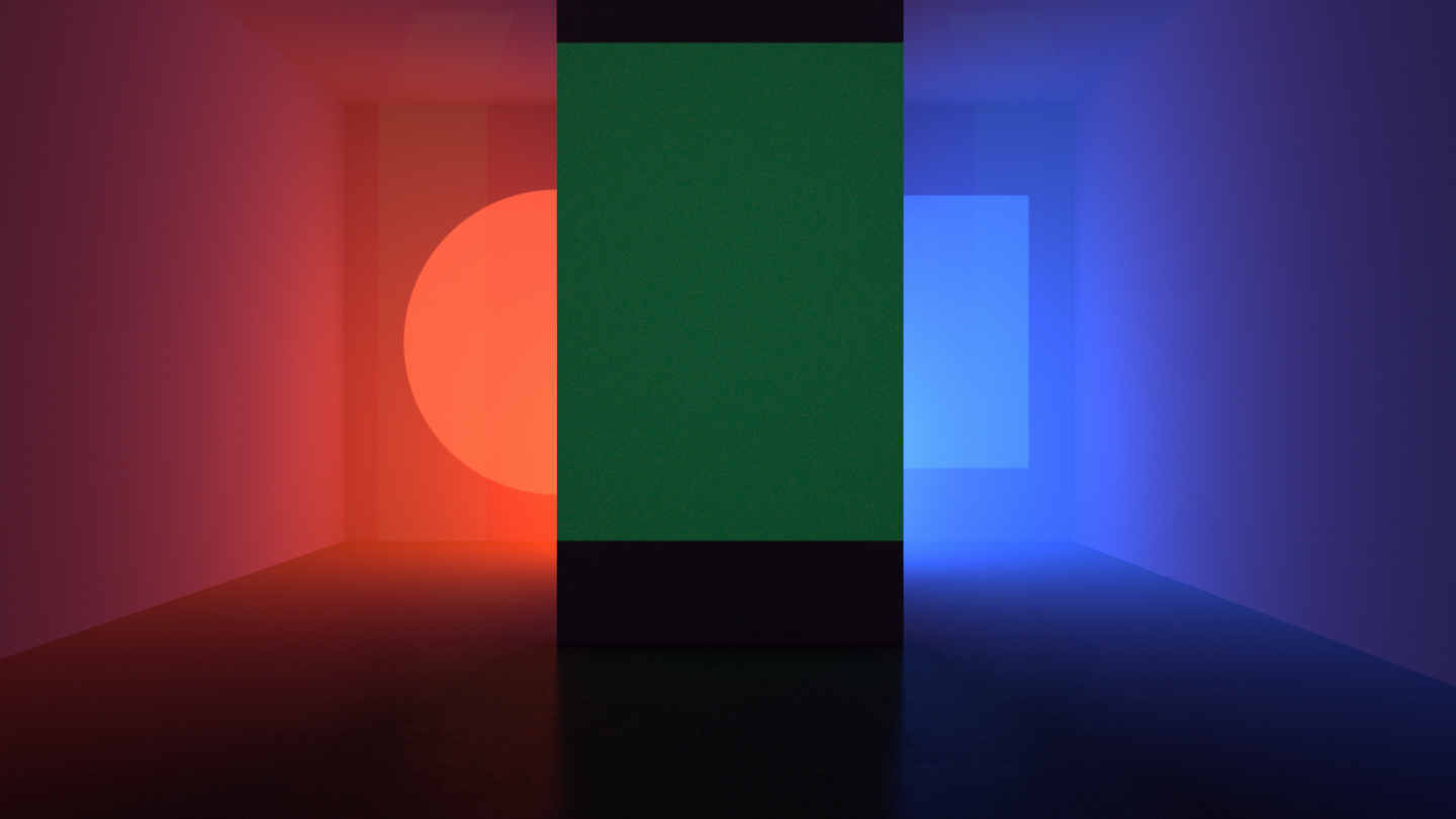
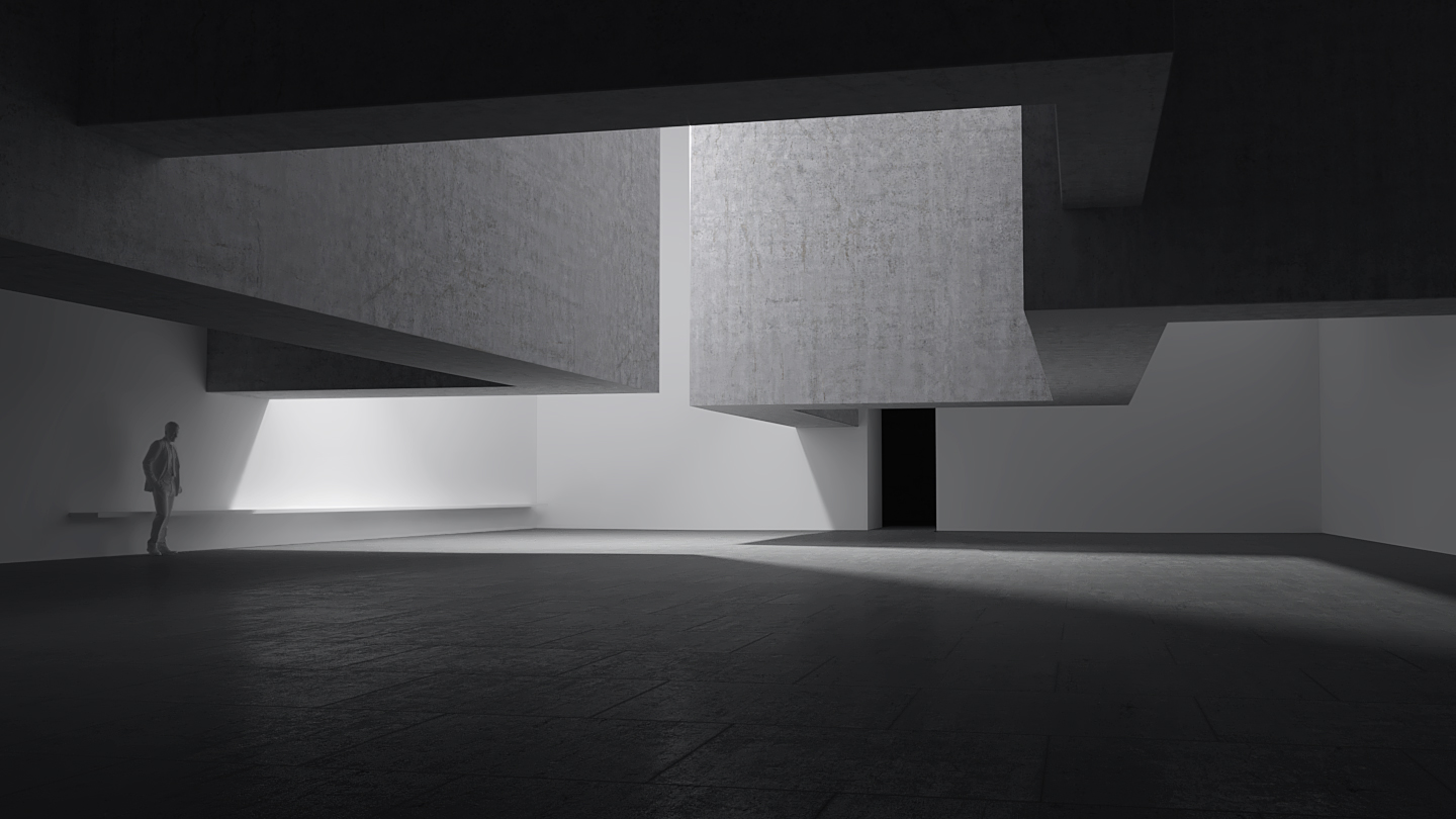
Opening with a sweeping camera move across an evolving landscape in timelapse, we nod to the icons of the past, honoring Microsoft’s heritage while diving into the future. We are then transported to a modern architectural space and slowly introduce the carefully crafted designs through a variety of visual techniques.

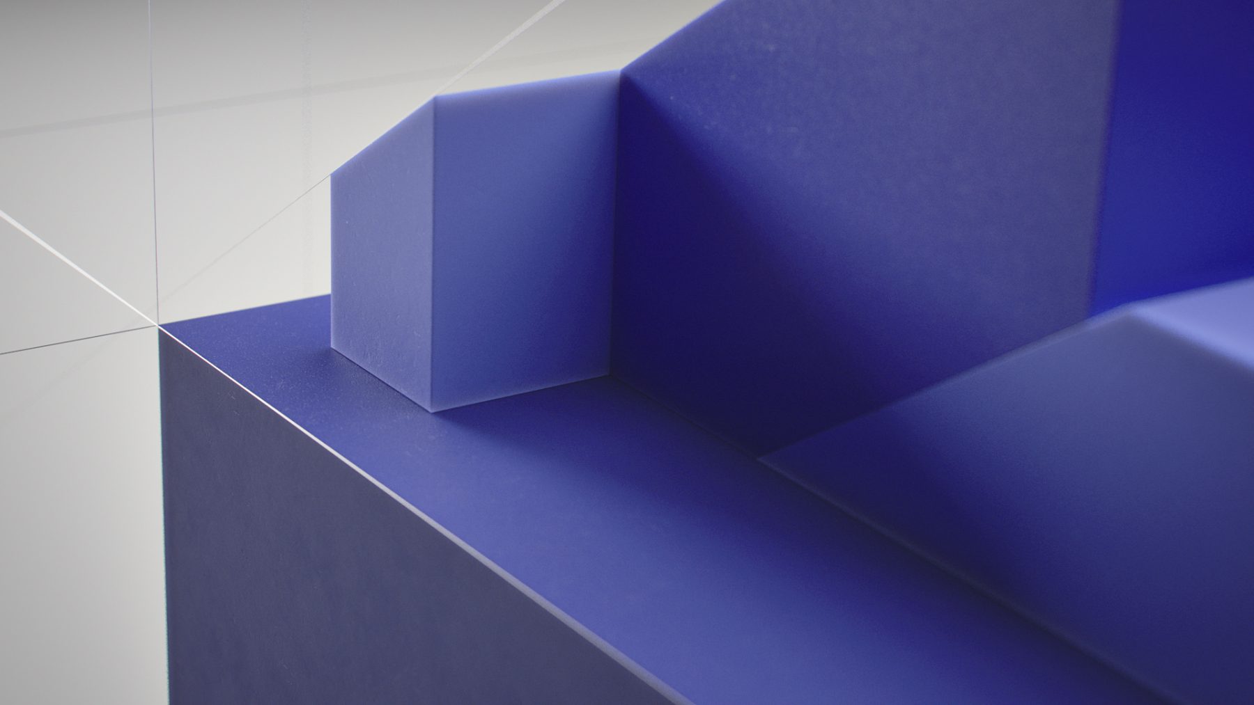
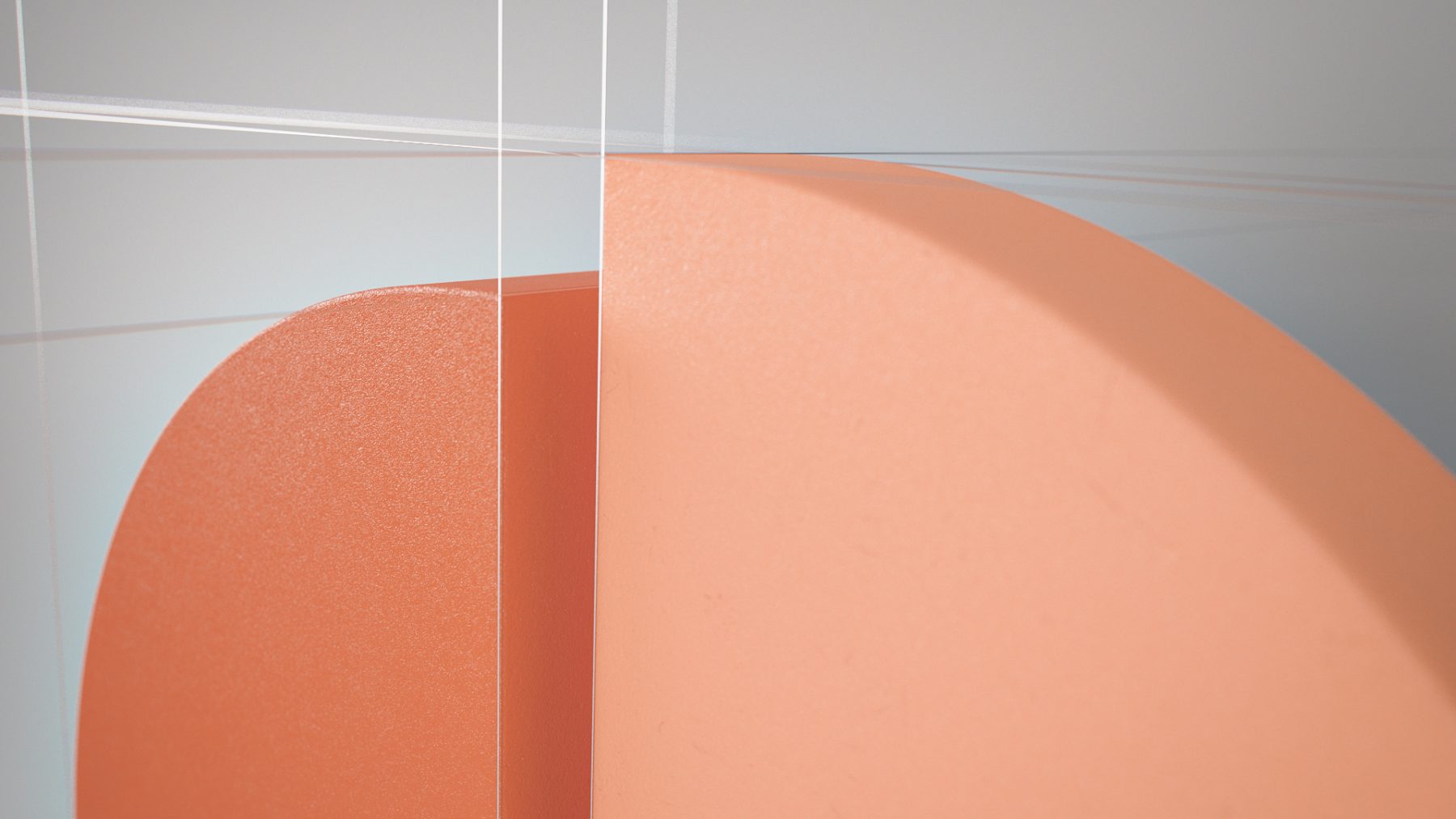
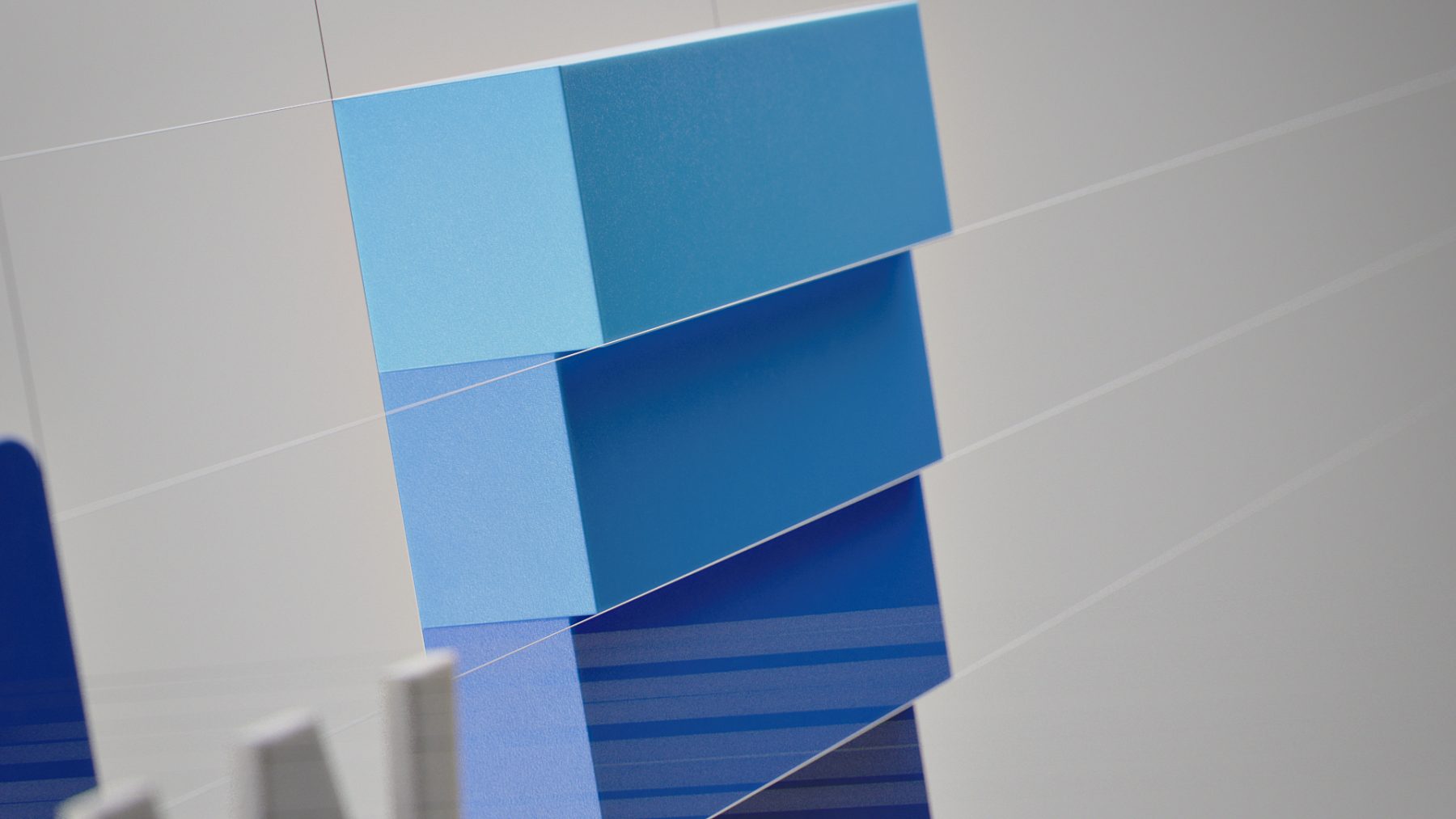
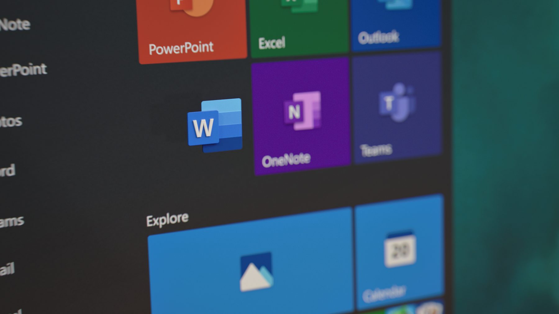
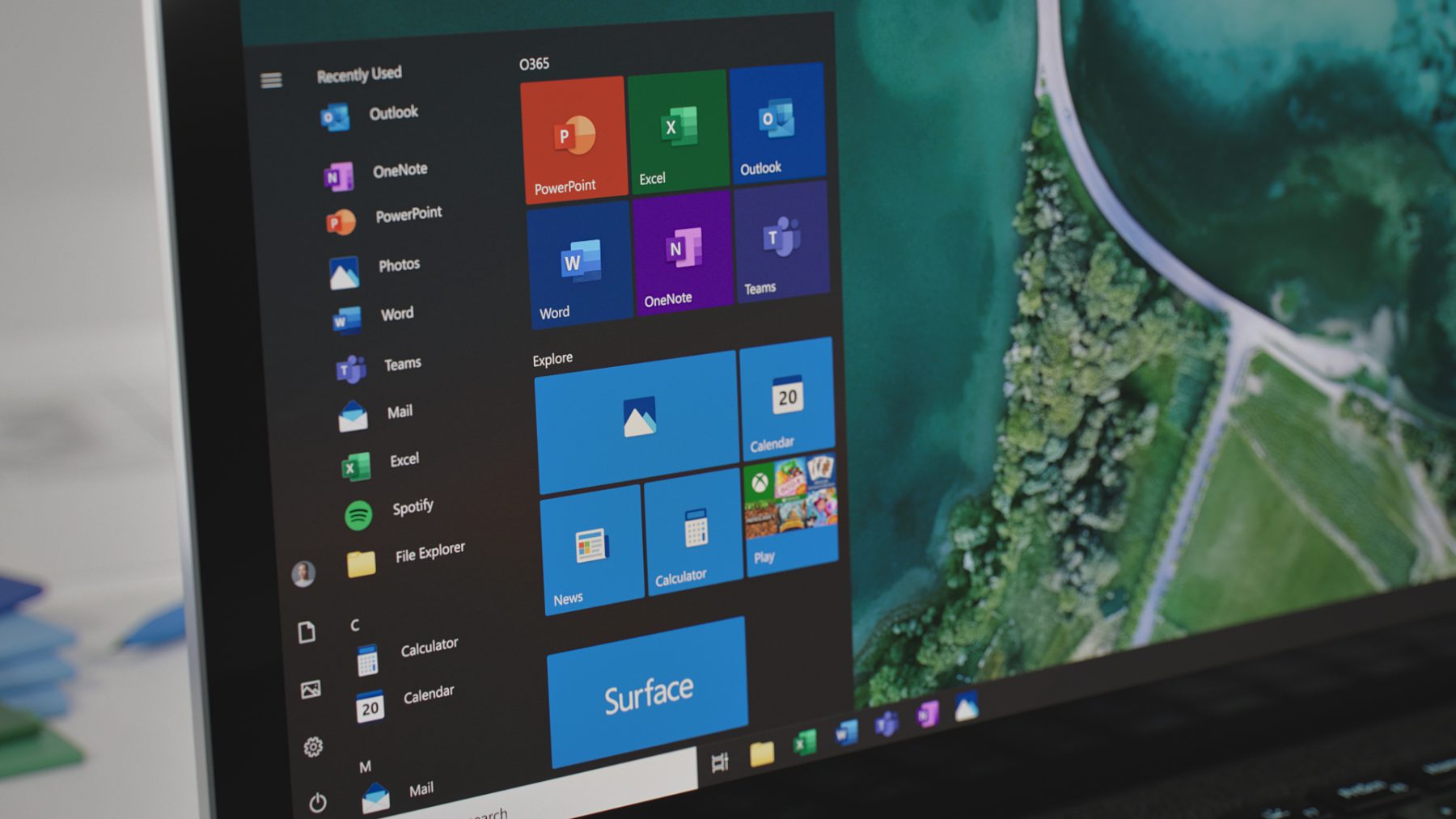
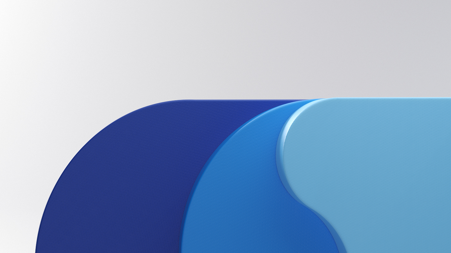
Visual Development


Credits
Client:
Microsoft
Microsoft Creative Director:
Nando Costa
Executive Producer:
Ashley Monaghan
Creative Directors:
Chris Bahry, Alex Torres
Producer:
John Szebegyinszki
Production Coordinator:
Jill Wilkie
Art Director:
Nidia Dias
Design:
Evaldas Cesnavicius, Nidia Dias, Somei Sun,
Joey Recoskie, Nicolás Castro, Yeseong Kim
Edit:
Alex Torres
Animation:
Somei Sun, Mauro Borba, Samuel Bohn,
Joey Recoskie, Jeff Briant
Lighting & Render:
Jeff Briant, Brad Husband, Nidia Dias
Compositing:
Chris Bahry
Storyboards:
Greg Boychuk
Sound Design & Music:
Zelig Sound
Voice Talent:
Amie Breedlove